Simple Tricks to Boost Your Landing Page Conversion Rates
When optimizing a website for better conversion rates, we often get caught up in overthinking and overcomplicating the changes we should make. Sometimes, we want to create solutions to problems that don’t necessarily exist, like redesigning the entire website.
In this article, we will present three simple tricks which required minimal work and helped us to increase conversions on our landing page to the registration step by over 100%. That’s right, with just three changes and less than two hours of work — in the same amount of time you spend swiping your Tinder account — you can implement these tips.
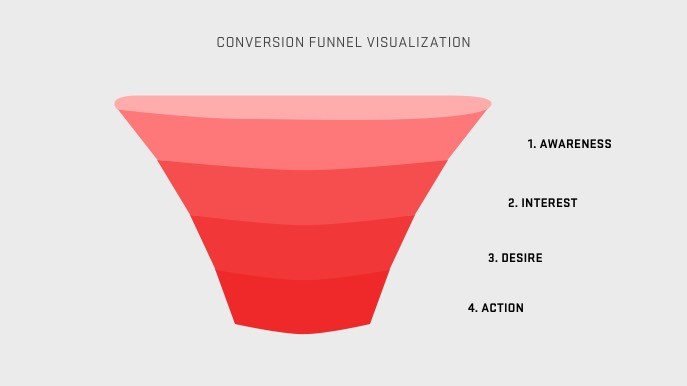
There are countless things that you could be focusing on when it comes to optimizing your website funnel for better performance in conversions, such as increasing product adoption. To make the most efficient decisions, you should focus on the website part above the fold, particularly on the main headline and the graphics that users see with no or minimal scrolling.
The following tricks can be adapted to your needs — whether it’s a single product, an e-commerce store, or a service website. Your business will thank you!
Finding the problem
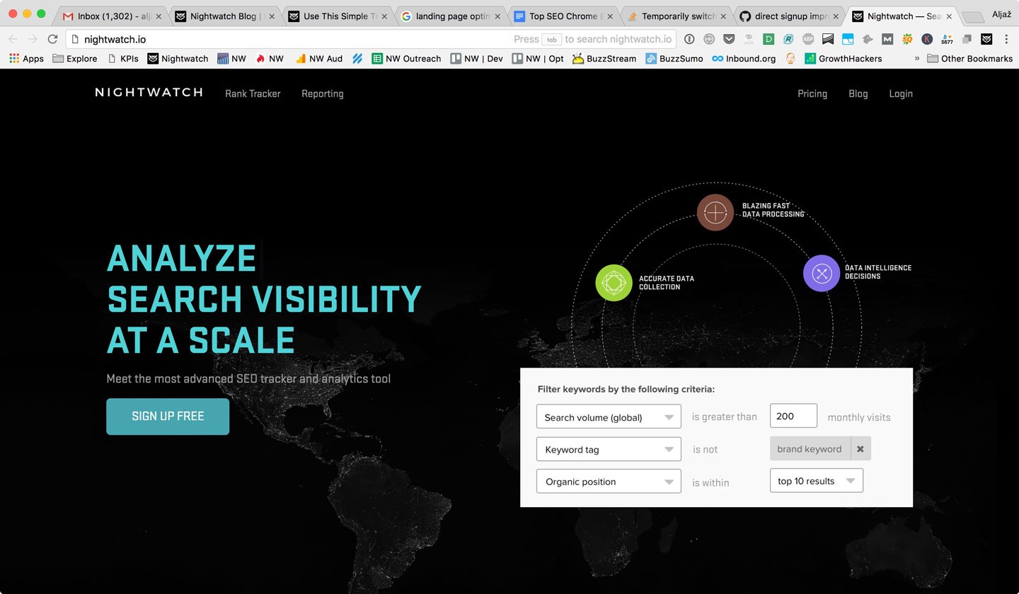
Here is how the first version of Nightwatch’s landing page looked:
Now, look at the funnel conversion in Mixpanel, the tool we use for tracking:
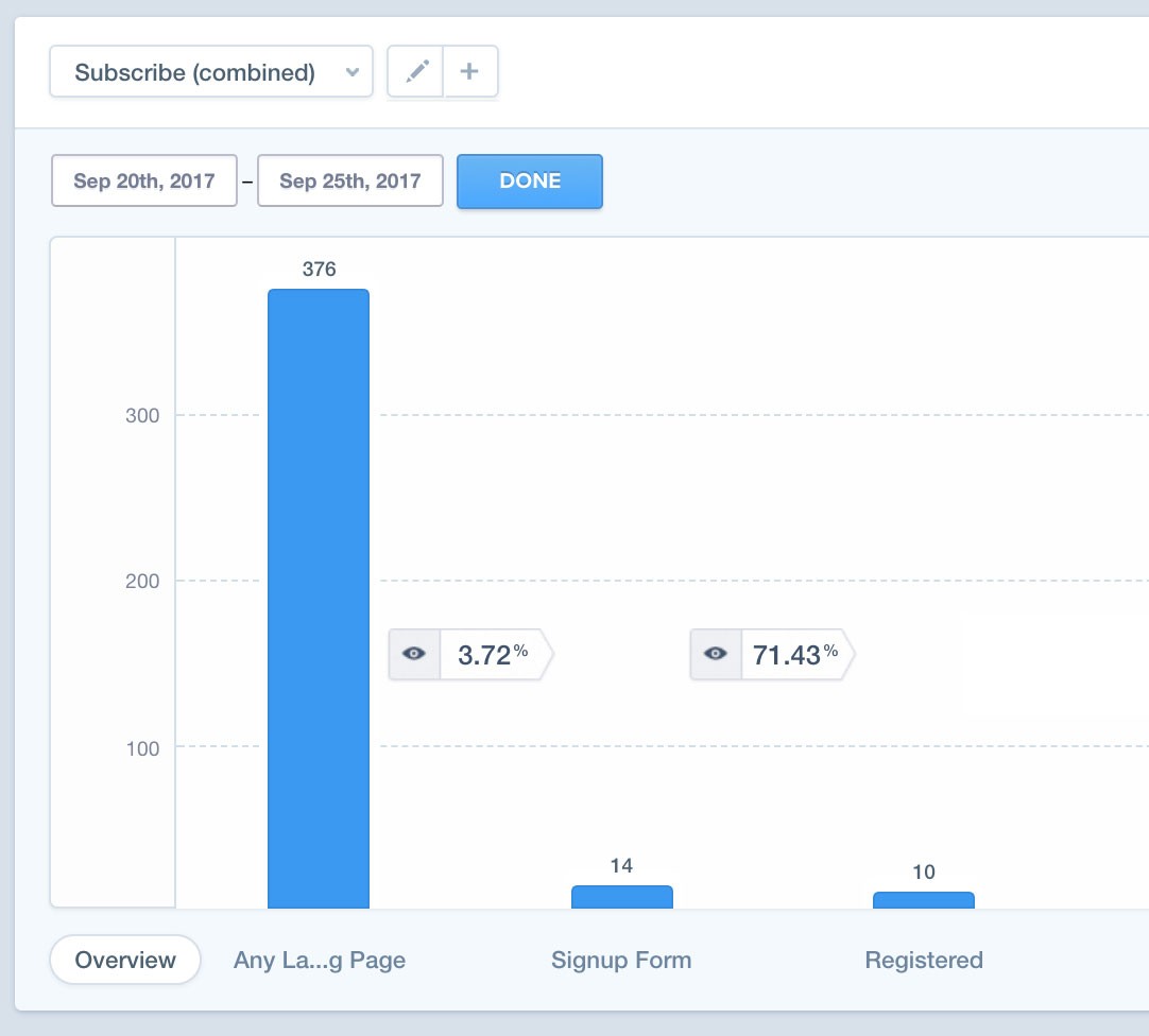
As you can imagine, we were quite disappointed to realize that the landing page is converting less than 4% to the Registration Page! heavy collective sigh
Finding the cause
After looking at the analytics data and installing a heatmap and mouse recording tools on the website, we quickly realized where the problem lies.
We suspected that the headline “Search Visibility Tool” was too abstract; it sounded like a device for internet ghost hunters, and it didn’t resonate with visitors, so the majority left the site without taking any actions.
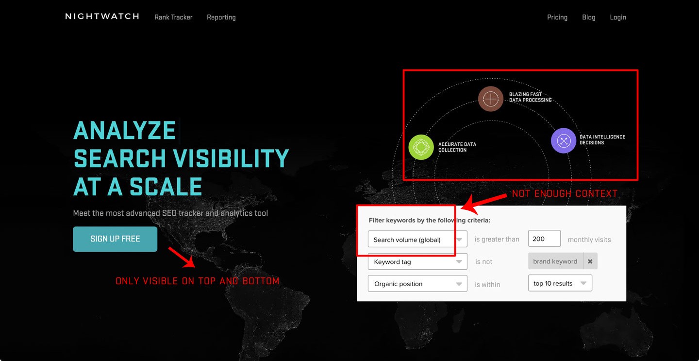
The other problem was that the main graphics were presenting the sophisticated features that only the most advanced users would understand. That doesn’t mean that we should completely get rid of this section, move the more detailed advantages of the product to an appropriate features subpage.
We also realized that there were only sign-up buttons at the top and bottom of each page, which is especially problematic if you’re browsing on a mobile device:
Comparing the website with our other product RankTrackr — which is geared towards different, modest needs — we got the feeling that we were missing one main thing, one thing that is holding back our conversions…
Ready? Here it is:
We need to make our product more tangible and help customers visualize themselves using it.
When marketing a certain product, it is very important to get the potential buyer as close to the product as you can, so he or she can get more familiar with it — before actually buying it.
Online marketing is quite different than selling cars, for instance, where they say that most deals are closed at the dealership. Who can resist the look, smell, and feel of a brand new car?
However, more and more often we see internet marketers forget about the power of visualizing and presenting the product so that it’s close to the visitor on the site.
Present the product properly
You can’t go far without this.
Imagine yourself when you get to a website like this:
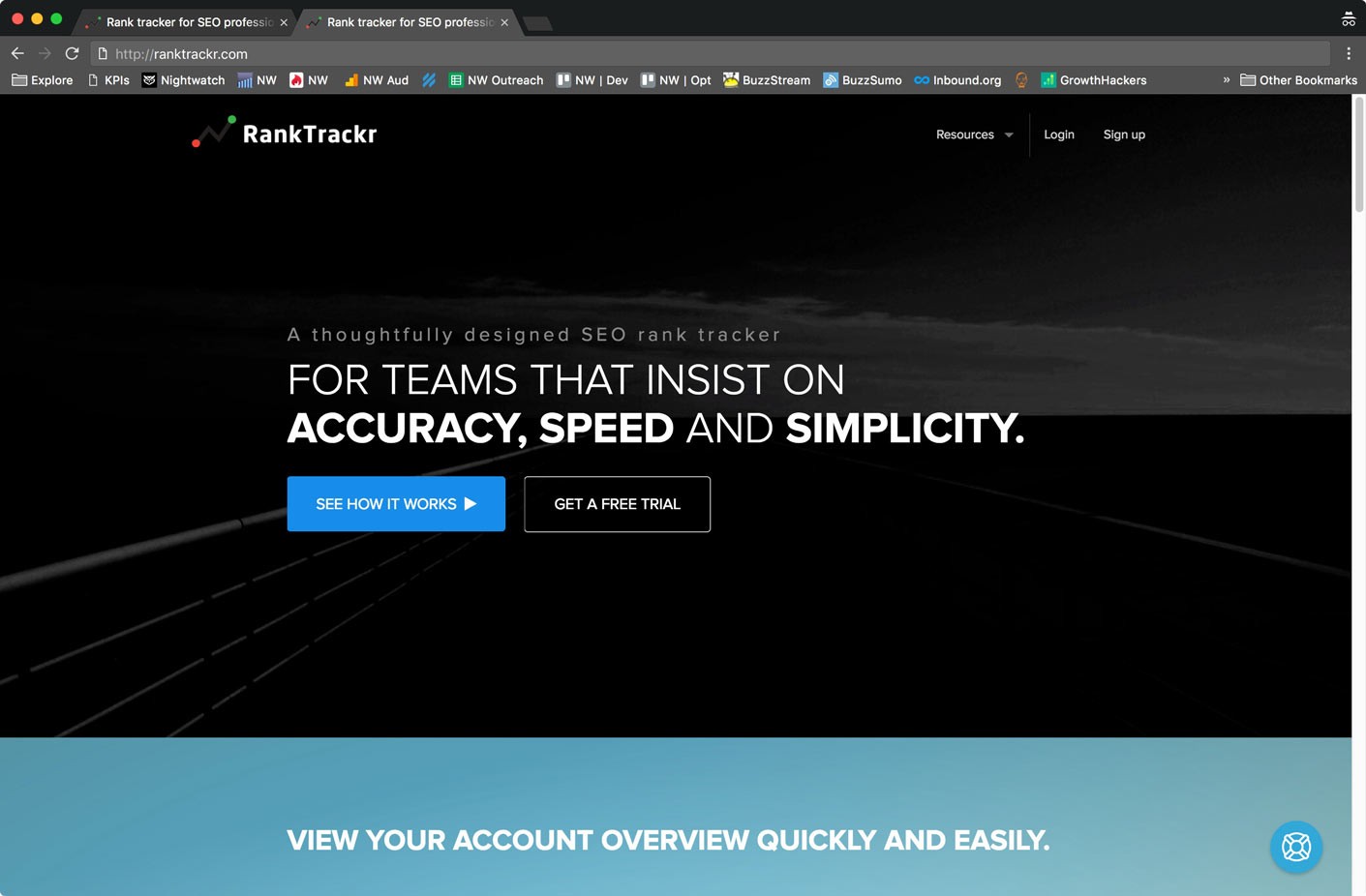
What does it make you feel about the product?
How about this:
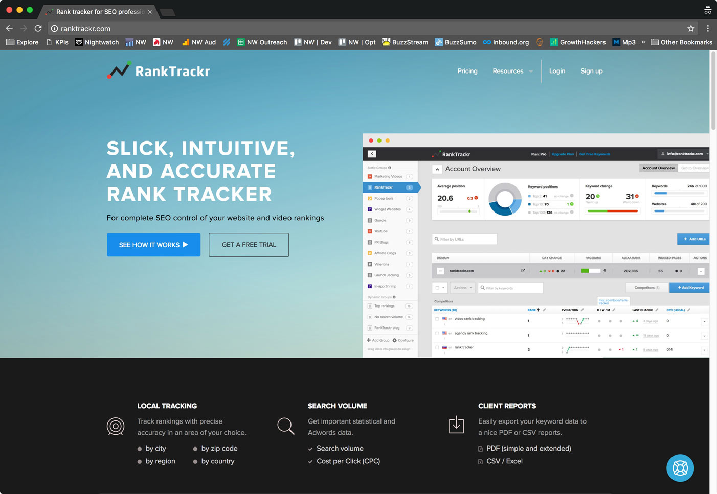
With Nightwatch we decided to try something more experimental. We placed an attention-grabbing element on the right side of the headline and wrote all the main features that the majority of the potential users should be familiar with. Besides that, we also slightly adjusted the main headline.
Here’s how it looks:
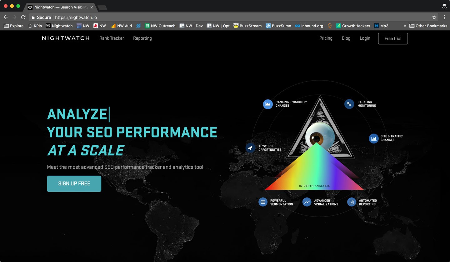
The first part of the landing page above the fold only mentions certain functionalities of the product, but as soon as we scroll below, we can actually see how the product looks on a MacBook. This helps us picture ourselves with the product, as we would do while sitting in a Ferrari at the car dealership.
And not only that: we also went further and added markups to the appealing presentation of the tool, right under the user’s fold:
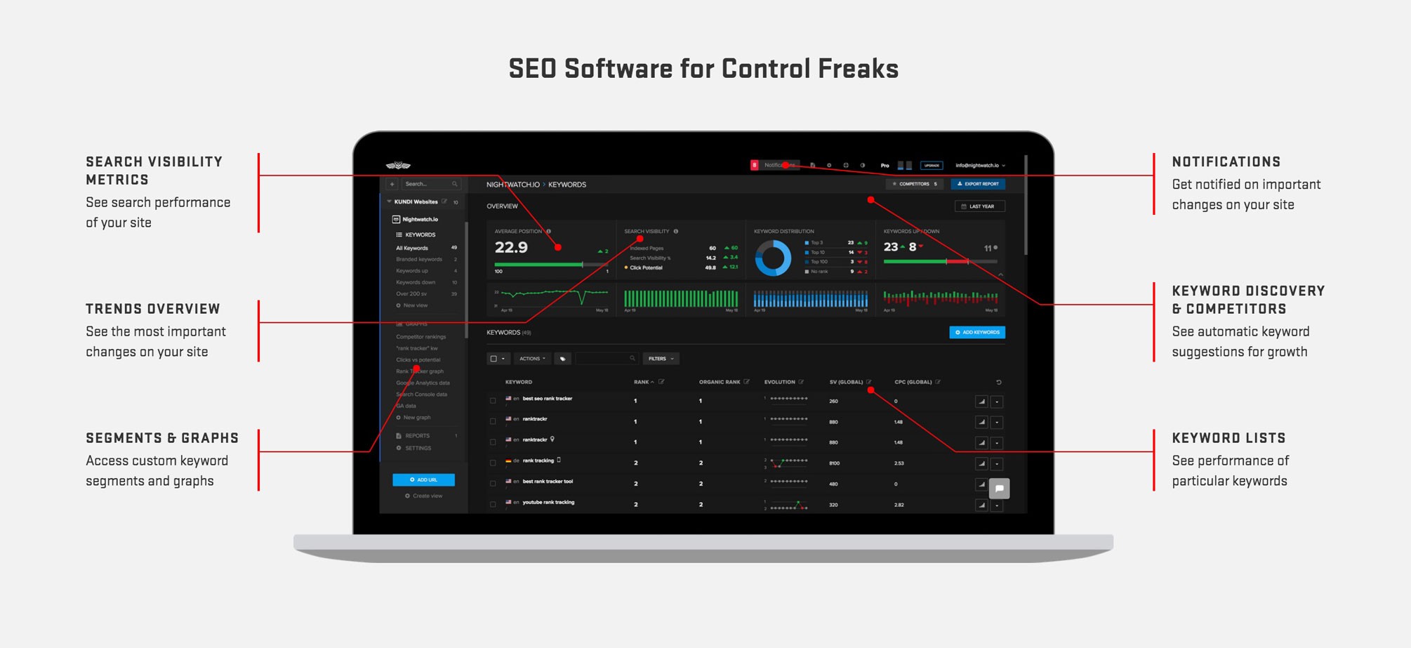
With this in mind, software companies showing how their products look on a computer or mobile device helps potential customers imagine themselves using it. This works especially well when a product is designed so that it complements the user’s lifestyle or other gadgets.
We must admit that although we’re not selling a fashion product, we did indeed spend an enormous amount of time making it look very sleek.
This helped to take our users a step towards understanding and imagining how Nightwatch could be useful and improve their SEO efforts and business in general.
This whole change took about 2 hours to implement — it could be done in less time, but we wanted to make it look good on mobile devices as well.
Make registration super easy
Another small improvement we added to the site was changing the navigation bar so that it stays on top of the screen. The “Free trial” button is always in the top right corner so users can go to the registration form whenever they want to — without having to find the registration button elsewhere on the site or scrolling back up or down.
Here’s how it looks:
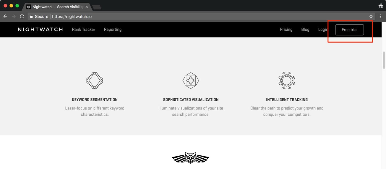
This step took approximately 15 minutes to implement and it will help save countless people from finger cramping.
Ok, so, that’s the theory. What about the results?
Let’s see…
After only 2 weeks, we can already see a great improvement:
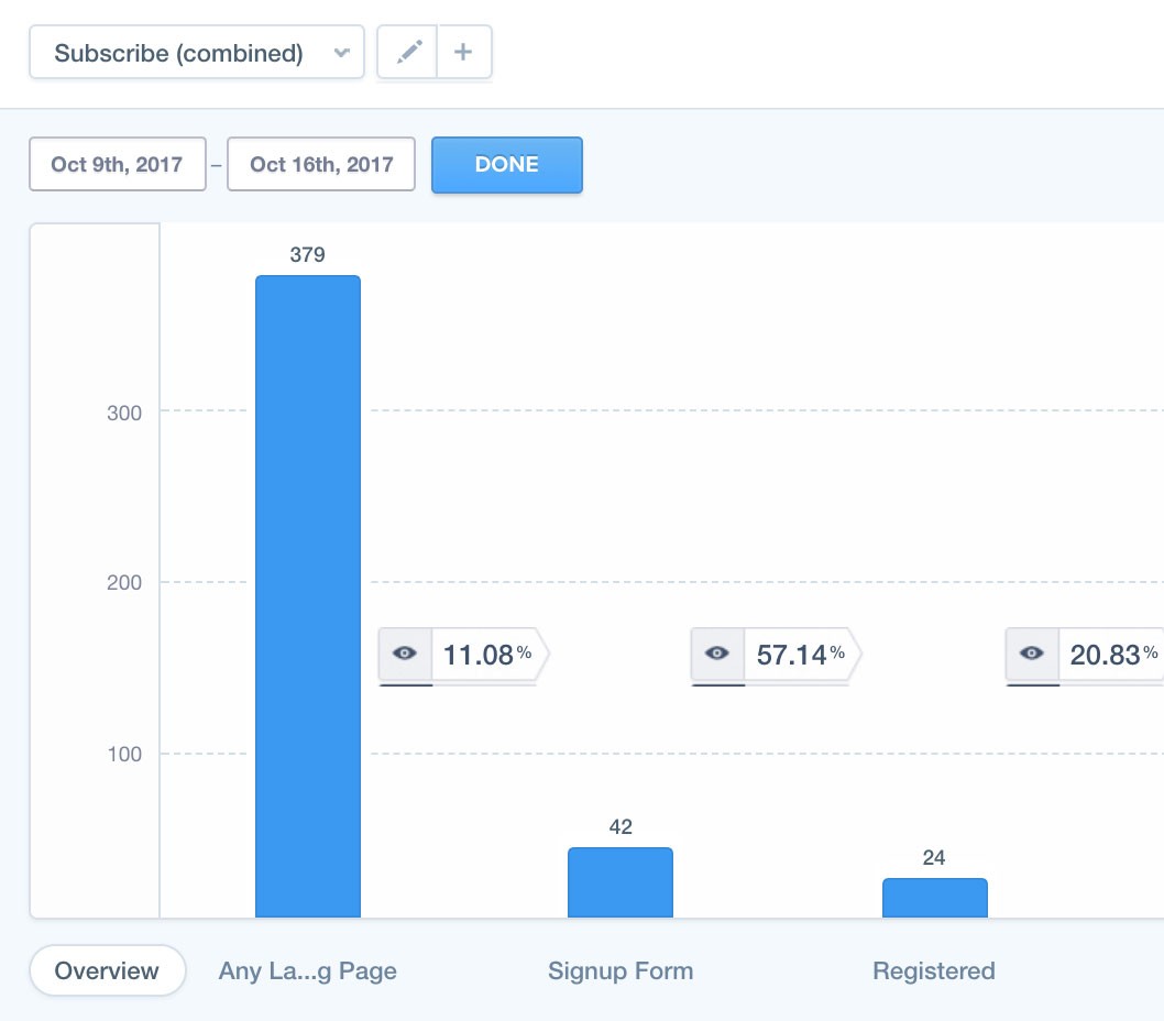
The conversion to the registration page went from less than 4% to more than 10% which is over 130% increase in conversion! Pretty cool, eh? You can use the same approach to improve the conversion rates on your websites. Just do a basic calculation of how much this would pay off in two, three, four months or a year with just a few hours of your time.
But that’s not the limit — we are going to get it over 15% in the following weeks.
For whatever reason, a number of online marketers keep underestimating the power of imagination and the fact that it’s worth investing time, money, and man-hours into an elaborate visual or media presentation. Why not try your best to provide users with the ultimate visual experience of using your product? It could become the secret weapon that not only boosts your conversions, but also the growth and success of your online business.
Join our mailing list using the form below and stay tuned as we share new tricks!
Got any other tips of your own you’d like to add? Share a tip in the comment section!
