Mobile vs Desktop Rankings: Why the Gap Is Widening and What to Do About It
Quick Takeaways
- Mobile and desktop rankings are genuinely different, even with mobile-first indexing fully in place
- Google completed its mobile-first indexing rollout in July 2024, but indexing and ranking remain separate processes
- Mobile SERPs include unique features like app packs and more prominent local packs that push organic results further down the page
- The same site can rank #3 on desktop and drop to #8 or lower on mobile for the same keyword
- Tracking both devices separately is the only way to see your actual search visibility
Introduction
You pull up your rank tracker. Position 4 for a keyword you’ve been grinding on for months. Then you pick up your phone, search the same term, and scroll. Your site isn’t anywhere on page one.
That’s not a glitch. It’s the normal state of affairs for many websites in 2026, and ignoring it means you’re optimizing for a version of search that doesn’t represent the majority of your visitors.
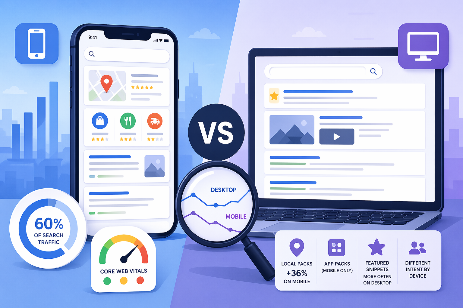
Most rank tracking setups default to desktop. Roughly 60% of global search traffic now comes from mobile devices. If your rank tracker is measuring desktop positions by default, it’s measuring the minority experience and missing the signals affecting the majority of your actual traffic.
The gap between mobile vs desktop rankings isn’t new. But it’s getting harder to ignore. This article explains why the divergence exists, what’s making it worse, and how to track and fix it.
Mobile-first indexing doesn’t mean mobile and desktop rank the same
This is the most common point of confusion around the topic, and it matters.
What Google’s July 2024 completion actually changed
Google officially completed its migration to mobile-first indexing in July 2024. This means the mobile version of a website is now what Google primarily uses for indexing and ranking purposes across all websites, without exception.
Before that, a small percentage of sites were still being crawled by the desktop Googlebot. That’s no longer the case. The mobile Googlebot now handles everything.
The September 2025 core update reinforced mobile performance as a stronger ranking factor alongside content quality and Core Web Vitals. Sites with consistently poor mobile metrics can see significant ranking drops and reduced visibility.
So mobile matters more than ever for how Google evaluates your content. But that still doesn’t mean your rankings will be the same on both devices.
Why indexing and ranking are separate processes
Google’s John Mueller addressed this directly. Mobile-first indexing primarily refers to the technical aspect of content indexing. Once the content is indexed, the ranking side is still essentially completely separate.
Mueller went on to explain that for some searches, the needs of users are different depending on the device, and that can influence rankings. Sometimes it has to do with things like speed. Sometimes it’s related to mobile friendliness. Sometimes it’s also related to the different elements shown in the search results page.
The practical takeaway: one index, two distinct ranking environments. Google pulls from the same pool of indexed content but applies different signals and shows different results depending on what device the search comes from.
Why do mobile and desktop rankings differ for the same keyword?
Device-specific ranking signals
Page speed is the most direct one. Mobile connections are slower and more variable than wired desktop connections, which means Google holds mobile pages to a tighter performance standard. A page with a 3-second load time on a fast connection might feel sluggish to someone on LTE.
Core Web Vitals measure this in Google’s own terms: Largest Contentful Paint, Cumulative Layout Shift, and Interaction to Next Paint. Sites that fail these thresholds on mobile get penalized in mobile results, even if their desktop numbers are clean.
Mobile-specific usability issues also factor in: unclickable buttons, text that requires zooming, content that renders differently on small screens. These are signals Google picks up during crawling with the mobile Googlebot.
Different search intent by device
Mobile wins in volume. Desktop wins in depth. Mobile is immediate. Desktop is deliberate.
Someone searching on their phone for “best CRM software” is often doing quick research between meetings. Someone searching the same term on a desktop at 10am on a Tuesday is probably evaluating options and ready to compare pricing pages. Google reads that context and shapes results accordingly.
For some searches, the user’s device can alter rankings because different elements are shown in the search results page. If you’re searching on your phone, you might want more local information because you’re on the go. If you’re searching on a desktop, you might want more images or videos shown in the results.
That shift in displayed results is part of what creates the ranking gap. User intent and SERP features interact differently by device — not just the position itself.
SERP layout differences that compound the problem
The same organic position doesn’t mean the same visibility. A SERP analysis of the same keyword on both devices often looks like two completely different pages. A featured snippet on desktop might occupy a quarter of the visible screen. On mobile, it can take up almost the entire screen before scrolling.
Desktop searches show featured snippets more often (86.5%) than mobile (73.3%). But when a snippet does appear on mobile, it dominates. That squeezes organic results down the page, which means your position 3 ranking might functionally behave like position 6 in terms of actual user attention.
| Factor | Mobile | Desktop |
|---|---|---|
| Share of global search traffic | ~60% | ~40% |
| Featured snippet frequency | 73.3% | 86.5% |
| Local pack frequency | Higher (36% more than desktop) | Lower |
| App packs | Yes (mobile only) | No |
| Click-through behavior | Quick answers, local intent | Research, comparison, B2B |
| Typical content engagement | Short, fast, local | Long-form, detailed |
Mobile SERP features are pushing organic results further down
App packs, local packs, and carousels
Mobile SERPs have features that simply don’t exist on desktop. App packs are one example: if Google detects app-related intent in a query, it inserts a block of app store links mid-page, pushing organic results below it. This feature is mobile-only.
Local packs are another. The frequency of local packs on mobile is 36% greater than on desktop. For any keyword with even faint local SEO intent, a mobile search is more likely to serve a map pack above organic results. That alone can shift your effective organic position significantly.
Despite the shared index, mobile and desktop results pages still look and feel completely different. Search intent is often very different depending on the device being used.
What this means for your tracked position
SERP monitoring needs to account for this. Raw keyword position doesn’t tell the whole story. A keyword where you hold position 3 on desktop but a local pack appears above the organic results on mobile means your position 3 is effectively lower on the device that gets 60% of searches.
If you’re only tracking mobile keyword rankings as an afterthought, or not at all, you’re missing the most consequential part of your visibility picture.
What does a mobile vs desktop ranking gap look like in practice?
The scenario most SEOs encounter
A site with poor mobile performance might rank position 5 on desktop and position 18 on mobile for the same competitive keyword. If your rank tracking only shows position 5, you’re making decisions based on data that misrepresents how most of your potential visitors actually find (or fail to find) you.
A keyword ranking #3 on desktop might be buried at #8 or lower on mobile — and you won’t know unless you track both.
This isn’t a rare edge case. Only 17% of websites keep their ranking positions across both mobile and desktop. Around 37% lose their positions when searches are made from mobile.
Where the gap hits hardest
The gap tends to be steepest in a few categories:
Local and e-commerce. These keywords have the highest local pack density on mobile. Even a well-optimized page can get pushed below the fold by map results. If you’re tracking local SEO rankings, you need device-split data — desktop positions for local keywords are often significantly better than mobile, which can give a false sense of security.
B2B software and SaaS. Intent is more research-heavy on desktop. Mobile rankings for B2B keywords are often lower because desktop is the dominant search device for that audience, meaning Google has less mobile signal to work with for your specific pages.
Anything with app alternatives. If there’s a mobile app that competes with your web content, Google may surface app packs for mobile users, reducing your organic visibility even if your content is strong.
The cost of tracking only one device
If your rank tracking setup only surfaces desktop data, you can spend months optimizing for a position you’re already holding, while a significant mobile ranking problem goes undetected. Content decisions, CRO tests, and link-building priorities can all be skewed by incomplete device data.
How to track mobile and desktop rankings separately
Why default setups miss this
Most rank trackers default to desktop results. Some tools require you to manually enable mobile tracking, and it often costs additional keyword credits. The result is that many SEO teams end up with a desktop-heavy picture of their keyword performance, even if they never explicitly decided to track that way.
The fix is straightforward: set up device-segmented tracking from the start, so you have clean, comparable data for both.
Setting up device-segmented tracking in Nightwatch
Nightwatch’s Rank Tracker tracks keywords on desktop and mobile separately. Each device counts as its own keyword entry, so tracking the same keyword on both devices means adding it twice — once for desktop, once for mobile.
Here’s how to do it:
- Step 1: Inside your URL dashboard, click All Keywords in the left sidebar, then hit the blue + Add Keywords button.
- Step 2: Type or paste your keyword into the field. Before saving, go to the Device setting and select Desktop. Save the keyword. Then repeat the process for the same keyword, this time selecting Mobile as the device. You now have two keyword entries tracking the same term on different devices.
- Step 3: Once both entries are collecting data, compare their positions side by side in your keywords list. Any keyword where the mobile rank is 4 or more positions below desktop is worth investigating for mobile UX or performance issues.
Nightwatch also tracks SERP features alongside positions, so you can see whether a local pack, featured snippet, or app result is suppressing your organic visibility on mobile specifically — not just your raw position number.
How to close the gap between mobile and desktop rankings
Fix Core Web Vitals on mobile first
Run your top-priority URLs through Google’s PageSpeed Insights and filter specifically for mobile scores. Desktop and mobile scores often diverge, and the mobile score is what feeds into your mobile-first indexing evaluation.
Target an LCP under 2.5 seconds and a CLS score below 0.1 on mobile. These are the thresholds where ranking impact becomes measurable.
Audit for mobile-specific content issues
Content that’s hidden behind tabs, accordions, or collapsible sections gets weighted differently on mobile. Google’s mobile crawler assigns full weight to expanded content — but make sure the content is actually accessible without requiring tap interactions that the crawler won’t trigger. A technical SEO checklist that covers mobile-specific rendering issues is worth running on your highest-priority pages.
Also check meta titles and descriptions. Character limits truncate earlier on mobile screens, and a truncated title can hurt click-through rates even when your position holds.
Use mobile SERP data to prioritize
Once you have device-segmented rank data, look for two things specifically:
Keywords where your mobile position is significantly worse than desktop — these point to technical or UX issues on the mobile version of that page.
Keywords where mobile positions are actually stronger than desktop — these often reveal content that maps well to on-the-go intent, and they’re worth expanding.
Don’t treat mobile and desktop as separate SEO problems. They share the same underlying content and authority signals. But they’re measured, displayed, and experienced differently — which means you need data from both to make good decisions.
Mobile vs desktop rankings: stop optimizing for the device that’s not driving your traffic
The gap between mobile vs desktop rankings is measurable, and for most sites, it’s significant. A position 4 on desktop that becomes a position 10 on mobile isn’t a small variance — it’s the difference between appearing on page one and not appearing at all for the device type that drives most of your traffic.
Start with clean data. Track both devices from the same dashboard, identify where your gaps are largest, and prioritize mobile technical fixes for those keywords first.
Ready to see where your mobile and desktop rankings actually stand? Start a free Nightwatch trial and set up device-segmented rank tracking in under five minutes.
Frequently asked questions
Are mobile and desktop rankings always different?
Not always, but they differ more often than most SEOs expect. Research suggests only 17% of websites maintain the same positions across both devices. The gap is most pronounced for keywords with local intent, app-related queries, and any niche where mobile SERP features like local packs or app packs are common. For purely informational queries with no local or app signal, mobile and desktop results tend to be closer together.
Does Google use the same index for mobile and desktop searches?
Yes. Since completing its mobile-first indexing rollout in July 2024, Google uses a single index for all content. But having one index doesn’t mean one set of rankings. Google applies different ranking signals depending on the device making the search — page speed, mobile usability, and SERP feature selection all vary by device, so results diverge even though they’re drawn from the same pool of indexed content.
Which device matters more for SEO: mobile or desktop?
Mobile carries more weight for most sites because it accounts for roughly 60% of global search traffic. Google’s mobile-first indexing also means the mobile version of your page is what sets your ranking ceiling. That said, desktop still matters — particularly for B2B, SaaS, and research-heavy queries where desktop is the dominant search device for that audience. The right answer is to track both and optimize based on where your actual audience is searching from.
How do I know if my site has a mobile vs desktop ranking gap?
You won’t know unless you track both separately. A rank tracker that only reports desktop positions can show you a healthy position 4 while your mobile rankings are on page two for the same keyword. Set up device-segmented tracking, then compare positions side by side. Keywords where mobile rank is 4 or more positions below desktop are your starting point for investigation.
What’s the fastest way to improve mobile rankings?
Start with Core Web Vitals on mobile. Run your key pages through Google’s PageSpeed Insights and look at the mobile score specifically — it’s often significantly lower than desktop. Focus on Largest Contentful Paint (target under 2.5 seconds) and Cumulative Layout Shift (target below 0.1). After that, check for mobile usability issues: text too small to read, buttons too close together, content hidden behind interactions that Google’s crawler won’t trigger. These fixes tend to have a faster ranking impact than content changes because they address direct mobile ranking signals.